 I saw this this weekend in the movie theatre and thought it was a great advertisement for the Mechanic movie. For one thing it's a gun made of guns. I love the orange color against the black backdrop- it really makes the shape pop. The text is white and simple and does not take away from the object itself.
Sunday, November 28, 2010
Guns and art
I saw this this weekend in the movie theatre and thought it was a great advertisement for the Mechanic movie. For one thing it's a gun made of guns. I love the orange color against the black backdrop- it really makes the shape pop. The text is white and simple and does not take away from the object itself.My newsletter
With all the programs I learned this semester, they all would benefit me with a newsletter.
InDesign would help me with layout and placement of the text. The guides in the program would help me align photos and type.
Photoshop would help me retouch and sharpen my photos. For instance, I could give myself whiter teeth or make background appear crisper.
Illustrator would help me by creating a logo for my organization. From there I can put it into indesign and brand the organization the newsletter is about.
Tuesday, November 16, 2010
Great Branding


It's the holiday and I always find Target has the best ads for store sales. Since target has a red logo- it works great with the Christmas ads. You add in a dog and a $67 Wii Fit and I would buy a lot of things from the store.
Tuesday, November 9, 2010
Logo a Gogo.
Logos and branding are everywhere.

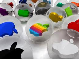 Apple is iconic and simple. You not only can change it accordingly, but I instantly know the icon without a font attached to it.
Lets start with the bad. This logo is for Vehicle Emissions Inspection Program
The reason I don't care for it is because there is a lot going on. IF this logo is printed in black and white, the bird disappears into the background.
The Good
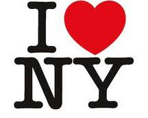
I love New York, but this icon is universally known. It's
simple and can be used in any color format
Apple is iconic and simple. You not only can change it accordingly, but I instantly know the icon without a font attached to it. Sunday, October 31, 2010
The wonders of color

Bad Color
I was doing an article on a candidate for congress, when they presented this picture on health care on their website. I wasn't sure if it as satirical or not. Even so, I it's a bad use of color since I can't read the signs. In addition, there is no consistency with the color. There is so much going on, I'm not sure where to look.
 I love this Boh picture. It's simple, but you know its for the ravens football team by the simple purple background. Without reading I instantly think Ravens. The color works well in this piece.
Saturday, October 30, 2010
Giving yourself a golden touch


I don't know if many of you are like me, but I didn't get a lot of sun this summer. I wondered how I could make my face appear to have a golden touch. I attempted to learn this technique in photoshop.
1. Import a simple photo of yourself. like this one.
2. On the photo, click the icon under the panel that is half black/half clear in the shape of a circle, once clicked, select the "photo filter" option.
3. a new layer will appear, with it. From there go to the "ADJUSTMENTS" panel and make sure you have selected a warming filter. I selected "warming filter 85". Then bring the density down so it matches what you like. I brought mine to about a 20 percent of so.
4. From there, copy the layer.
5. In the new layer, change in the upper left hang corner from "normal" to "overlay" and bring down the opacity until you have a glow you like.
You can see the before and after above.
Tuesday, October 26, 2010
Frame design, out of the box and working.

This might not be the best picture of this, but when I was in college I remember getting a brochure about design and it opened like a picture frame. I think this design works because it's creative and it got me interested in the idea of what I could achieve as a designer.
Subscribe to:
Posts (Atom)