Sunday, October 31, 2010

The wonders of color

Bad Color

I was doing an article on a candidate for congress, when they presented this picture on health care on their website. I wasn't sure if it as satirical or not. Even so, I it's a bad use of color since I can't read the signs. In addition, there is no consistency with the color. There is so much going on, I'm not sure where to look.
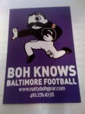


I love this Boh picture. It's simple, but you know its for the ravens football team by the simple purple background. Without reading I instantly think Ravens. The color works well in this piece.

Saturday, October 30, 2010

Giving yourself a golden touch


I don't know if many of you are like me, but I didn't get a lot of sun this summer. I wondered how I could make my face appear to have a golden touch. I attempted to learn this technique in photoshop.

1. Import a simple photo of yourself. like this one.

2. On the photo, click the icon under the panel that is half black/half clear in the shape of a circle, once clicked, select the "photo filter" option.

3. a new layer will appear, with it. From there go to the "ADJUSTMENTS" panel and make sure you have selected a warming filter. I selected "warming filter 85". Then bring the density down so it matches what you like. I brought mine to about a 20 percent of so.

4. From there, copy the layer.

5. In the new layer, change in the upper left hang corner from "normal" to "overlay" and bring down the opacity until you have a glow you like.

You can see the before and after above.

Tuesday, October 26, 2010

Frame design, out of the box and working.


This might not be the best picture of this, but when I was in college I remember getting a brochure about design and it opened like a picture frame. I think this design works because it's creative and it got me interested in the idea of what I could achieve as a designer.

Tuesday, October 19, 2010

My favorite college newspaper


I must confess I still read my college newspaper. It was where I learned all my journalism skills. When I also used to write for the Diamondback, I remember using grid structure like in this piece. To this day they still follow a four grid piece. It flows and the jumps are easy to locate.

Wednesday, October 13, 2010

Job seekers

I know a lot of people are looking for employment, but I found these websites helpful

http://www.journalismjobs.com

http://cubreporters.org/jobs.html

Tuesday, October 12, 2010

Layouts I liked.

I remember seeing this layout recently and loving the text wrap around the lollipop. I like it because there is a good balance of graphic to words. The flooding could use some touching up on, but I don't see that until later.

Monday, October 11, 2010

How Indesign has helped me

Indesign has made my life easier when it comes to designing, especially with the small things like copying, adding additional photos and using color. For instance in my last typography project, I used the word "crossword" and put the words into scrabble pieces. By using the simple shift command to copy, it made it so much easier then having to click on the words copy and paste. For me, by learning the tricks and codes on they keyboard, I am saving valuable time when it comes to designing.


Tuesday, October 5, 2010

Textual Concepts


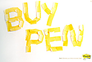
I believe a san-serif font was the inspiration for this ad. I think it's a clever use of text because it makes you remember the importance of having a pen.


This picture of the text messages was a great use of text because he shows the danger of using your cell phone while driving.