 I saw this this weekend in the movie theatre and thought it was a great advertisement for the Mechanic movie. For one thing it's a gun made of guns. I love the orange color against the black backdrop- it really makes the shape pop. The text is white and simple and does not take away from the object itself.
Sunday, November 28, 2010
Guns and art
I saw this this weekend in the movie theatre and thought it was a great advertisement for the Mechanic movie. For one thing it's a gun made of guns. I love the orange color against the black backdrop- it really makes the shape pop. The text is white and simple and does not take away from the object itself.My newsletter
With all the programs I learned this semester, they all would benefit me with a newsletter.
InDesign would help me with layout and placement of the text. The guides in the program would help me align photos and type.
Photoshop would help me retouch and sharpen my photos. For instance, I could give myself whiter teeth or make background appear crisper.
Illustrator would help me by creating a logo for my organization. From there I can put it into indesign and brand the organization the newsletter is about.
Tuesday, November 16, 2010
Great Branding


It's the holiday and I always find Target has the best ads for store sales. Since target has a red logo- it works great with the Christmas ads. You add in a dog and a $67 Wii Fit and I would buy a lot of things from the store.
Tuesday, November 9, 2010
Logo a Gogo.
Logos and branding are everywhere.

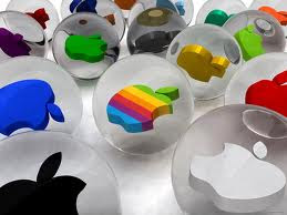 Apple is iconic and simple. You not only can change it accordingly, but I instantly know the icon without a font attached to it.
Lets start with the bad. This logo is for Vehicle Emissions Inspection Program
The reason I don't care for it is because there is a lot going on. IF this logo is printed in black and white, the bird disappears into the background.
The Good
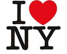
I love New York, but this icon is universally known. It's
simple and can be used in any color format
Apple is iconic and simple. You not only can change it accordingly, but I instantly know the icon without a font attached to it. Sunday, October 31, 2010
The wonders of color

Bad Color
I was doing an article on a candidate for congress, when they presented this picture on health care on their website. I wasn't sure if it as satirical or not. Even so, I it's a bad use of color since I can't read the signs. In addition, there is no consistency with the color. There is so much going on, I'm not sure where to look.
 I love this Boh picture. It's simple, but you know its for the ravens football team by the simple purple background. Without reading I instantly think Ravens. The color works well in this piece.
Saturday, October 30, 2010
Giving yourself a golden touch

I don't know if many of you are like me, but I didn't get a lot of sun this summer. I wondered how I could make my face appear to have a golden touch. I attempted to learn this technique in photoshop.
1. Import a simple photo of yourself. like this one.
2. On the photo, click the icon under the panel that is half black/half clear in the shape of a circle, once clicked, select the "photo filter" option.
3. a new layer will appear, with it. From there go to the "ADJUSTMENTS" panel and make sure you have selected a warming filter. I selected "warming filter 85". Then bring the density down so it matches what you like. I brought mine to about a 20 percent of so.
4. From there, copy the layer.
5. In the new layer, change in the upper left hang corner from "normal" to "overlay" and bring down the opacity until you have a glow you like.
You can see the before and after above.
Tuesday, October 26, 2010
Frame design, out of the box and working.

This might not be the best picture of this, but when I was in college I remember getting a brochure about design and it opened like a picture frame. I think this design works because it's creative and it got me interested in the idea of what I could achieve as a designer.
Tuesday, October 19, 2010
My favorite college newspaper

I must confess I still read my college newspaper. It was where I learned all my journalism skills. When I also used to write for the Diamondback, I remember using grid structure like in this piece. To this day they still follow a four grid piece. It flows and the jumps are easy to locate.
Wednesday, October 13, 2010
Job seekers
I know a lot of people are looking for employment, but I found these websites helpful
http://www.journalismjobs.com
http://cubreporters.org/jobs.html
http://www.journalismjobs.com
http://cubreporters.org/jobs.html
Tuesday, October 12, 2010
Layouts I liked.
 I remember seeing this layout recently and loving the text wrap around the lollipop. I like it because there is a good balance of graphic to words. The flooding could use some touching up on, but I don't see that until later.
Monday, October 11, 2010
How Indesign has helped me
Indesign has made my life easier when it comes to designing, especially with the small things like copying, adding additional photos and using color. For instance in my last typography project, I used the word "crossword" and put the words into scrabble pieces. By using the simple shift command to copy, it made it so much easier then having to click on the words copy and paste. For me, by learning the tricks and codes on they keyboard, I am saving valuable time when it comes to designing.
Tuesday, October 5, 2010
Textual Concepts

I believe a san-serif font was the inspiration for this ad. I think it's a clever use of text because it makes you remember the importance of having a pen.
This picture of the text messages was a great use of text because he shows the danger of using your cell phone while driving.

Tuesday, September 28, 2010
Another great design


I have seen pictures of the no H8 campaign. I think it's a great play on simple type that sends a message for equality. It's easy to read and it's a great play on "Prop 8" and the word "H8". In all, the design tells alot without writing a lot, which is why it appealed to me.
Sunday, September 26, 2010
Lovely Designs
 Everytime I see a Peace Corps advertisement, I think about my life. The simple phrase "Life is calling, how far will you go" makes me think about my life and if I'm living to my full potential. This message is emphasized by the by the picture of the man on the pole. If he's answering the call, I feel like I could to.
Tuesday, September 21, 2010
The asymmetrical approach
 To me this picture is an example of asymmetrical design. When we talked about the rule of thirds in class, I took the ad and folded it. My eye went straight for the dark green and red jelly beans, which were in the line of vision like in the rule of thirds.
I see this and believe it's balanced because I imagine the jelly beans are scattered on a table, about to be eaten.
There is nothing more symmetrical than spoons.

Symmetrical
I love the Halloween season. When I was looking for a caramel apple recipe I came across this advertisement in Family Circle magazine. I think it's a good display of symmetry because the spoons are equal on both sides, which is the first thing I notice. From there they are numbered with a variety of soups. The balance of the elements makes is very visually appealing and I'm left feeling hungry in the end.
Wednesday, September 15, 2010
Learning CS5 one ghost at a time
I decided to make a costume party invitation for my project in PBDS 502. I instantly found the ghost picture I wanted. The only problem I ran into was merging the photo with the text. As I put the two next to each other, I found that my ghost's hand kept getting cut off. I asked for help. I was pointed to the object>arrange button. This allowed me to bring the text boxes to the foreground of background. This help me merge the two objects so they appeared as if they flowed together. Though my design looks very simple, it merged well in the end.
Sunday, September 12, 2010
The Hunt for figure+ground and a little CRAP as well

Unless I saw the tiny logo at the bottom, I would not be aware this was an ad campaign from the WWF. Anyway, I think this is a great example of figure, ground because the image of the reptile blends in with the cracks in the soil. At first glance I was just see the cracks, only to discover the form an animal as well. I like how it blends in so well.
 CRAP
CRAP
I was looking design ideas for my bedroom when I came across the cover of this book. I think it's a simple version of contrast, repetition, alignment, and proximity.
For one the thing, the contrast is created with the color of the chairs. Also through the chairs you get the repetition of one almost being on top of one another. With alignment, I feel the text is just proportional, almost centered with the chairs to add to the simplicity. Together these elements help create the book cover.
 CRAP
CRAPI was looking design ideas for my bedroom when I came across the cover of this book. I think it's a simple version of contrast, repetition, alignment, and proximity.
For one the thing, the contrast is created with the color of the chairs. Also through the chairs you get the repetition of one almost being on top of one another. With alignment, I feel the text is just proportional, almost centered with the chairs to add to the simplicity. Together these elements help create the book cover.
Monday, September 6, 2010
My idea of Good design

While on the plane back to Baltimore, I came across this design and thought it was a great piece. The reason I think it's a good design is because it's simple, colorful, and made me gaze at it a second time.
From the few design classes I've taken, I was taught that simplicity is an important factor. While this thought has never left me, it's something I keep in mind every time I look at graphics. There isn't a lot of type to this cover, but I instantly get an idea of what the cover story is about just from looking at the waffle.
In addition, I love how the waffle flows with the color of the type. I think the light blue background makes it pop and the shadow of the paint brush adds just a little bit of depth.
_________________________________________
 Another design I liked was this Chipotle advertisement. I guess the main reason I liked it was it was different. I was pulled in by the fact they are conveying two messages: 1. the burritos are good and 2. information about where the ingredients come from.
I could debate about the wording, but I like that certain words are bolded while the others are in a light gray. I like the the typeface was simple and in the same font. While there is a lot of text to this display, I was taken by how the important point was highlighted in another color. In all, I got the complete message the design was trying to convey.
Sunday, September 5, 2010
Graphic Designs I didn't like
I came across this advertisement while in Edmonton, Canada this weekend. As I was driving, I was really struck by the message. I was so struck by it that I decided to incorporate it into my blog. The design is  simple, and straight to the point. Yet it's boring and I don't understand what message it is trying to convey. Is it a divorce firm? or is it a place to get help for divorcing? If you wanted to know, it's actually a place to get counseling, which I looked up (maybe that was the point of the advertisement?).
While I like that the message is simple, it doesn't seem so flow, especially with both the typeface and color scheme. For instance "Divorce the" is all in caps and bolded in an orange-red color while the word "Fair" is bolded, lower cased and in black. The word "way" just exists as if it were styled in times new roman.
The main reason I don't like this graphic is because I think the flow of the two fonts doesn't go well against the white background. I feel a better typeface could of spruced up the message.
 simple, and straight to the point. Yet it's boring and I don't understand what message it is trying to convey. Is it a divorce firm? or is it a place to get help for divorcing? If you wanted to know, it's actually a place to get counseling, which I looked up (maybe that was the point of the advertisement?).
While I like that the message is simple, it doesn't seem so flow, especially with both the typeface and color scheme. For instance "Divorce the" is all in caps and bolded in an orange-red color while the word "Fair" is bolded, lower cased and in black. The word "way" just exists as if it were styled in times new roman.
The main reason I don't like this graphic is because I think the flow of the two fonts doesn't go well against the white background. I feel a better typeface could of spruced up the message.
_______________________________________________________________

I found this design in my newspaper. Even though I think the advertisements for Cliff's Hi-Tech body shop are funny (they have three other ones like this), I think the display is a little scattered. First of all it's to busy. I spot three different typefaces and I'm not even halfway through the graphic. I think things need to get switched around and simplified to better enchance the picture. I think the photo needs to be the main focus. With so much type around it, it becomes more of a background shot then the thing I'm suppose to be engaged with.
Friday, September 3, 2010
I should be working...but I thought this was funny

As my first post, I came across this old article in my newspaper's archives. It made me laugh and I want to share it with the class. The article is from 1970, I think graphic design has come a long way since then.
Subscribe to:
Posts (Atom)